Using the Smith College Logo
The Smith College logo should be a significant graphic element in any communication. Several versions of the logo are available. When in doubt about which version of the logo to use, please contact College Relations.
Logos
Logos and seals are “marks” of the college and convey institutional endorsement and authority. A logo is used as an identifying mark or symbol to unify a variety of the college’s materials, including communications with internal and external audiences. The college has both an informal and a formal logo, each available in horizontal or stacked lockups.
The Formal Logo
- For formal or official uses, such as stationery and business cards
- Can be used in its official blue-and-yellow format or, if used in single-color format, any of the approved colors
- Should not be combined with other marks, including the informal seal
The Informal Logo
- For most marketing communications
- For layouts with busy backgrounds
- For applications where it’s necessary to identify the college by name, such as posters
- Can be combined with other marks, such as the informal seal
Guidelines
To maintain consistency, the college’s logos should never be altered in any way. Always use official logo files available on the Resources page.
- Never stretch, condense or rotate the marks.
- Never attempt to typeset, embellish, or otherwise alter or re-create the logos.
- Never change the arrangement or scale of elements in the logos.
- Never apply bevels, drop shadows or other effects to the logos.
- Never use a different color for the icon and wordmark. Never use a color that is not in the branding palette.
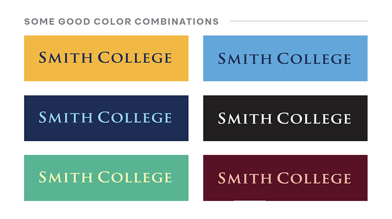
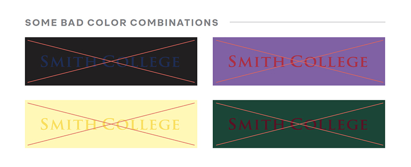
- Never use color combinations that have insufficient contrast or that cause visual “vibration.”
If you are unsure if your anticipated logo use is appropriate, or how best to apply the logo and maintain the brand guidelines, contact college relations.
Logo Clear Space
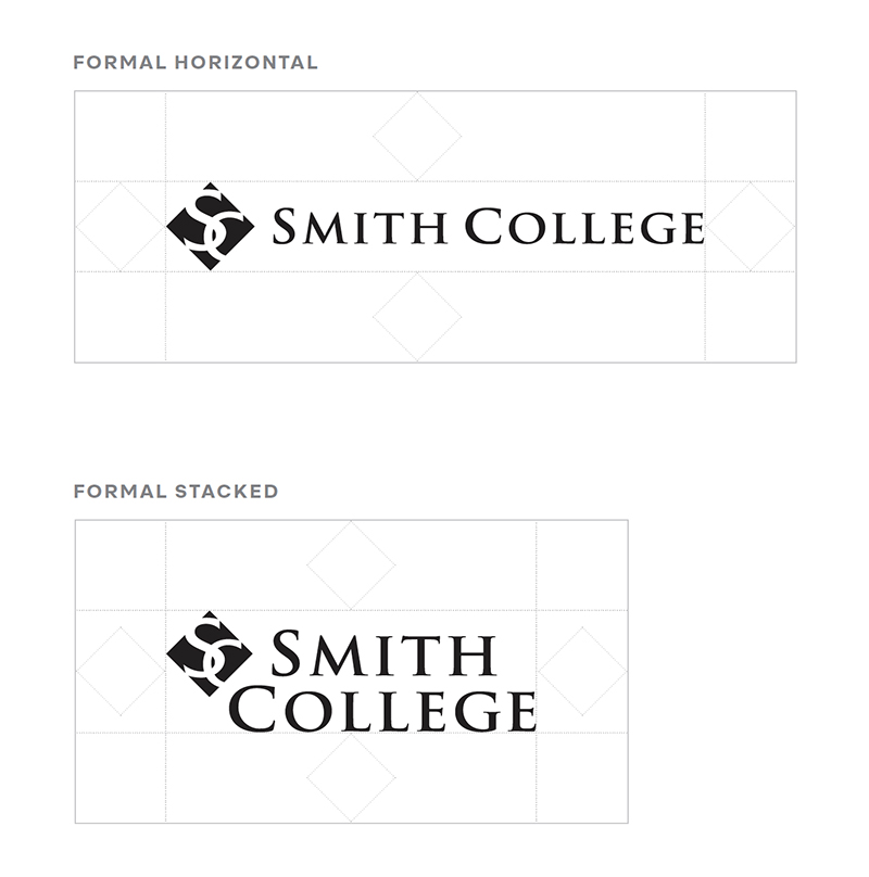
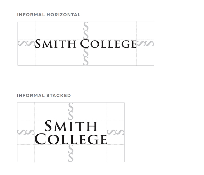
To ensure prominence and legibility, always include clear space around college logos. For the formal logo, this space is equal to the height or width of the “SC” diamond icon on all sides. For the informal logo, this space is equal to twice the height of the “S” in the wordmark on all sides. It is always okay to use more than the minimum amount of space.
Minimum Sizes
The logo loses prominence and legibility as it gets smaller. Use the minimum sizes only when absolutely necessary. For the horizontal logos, measure by width. For the stacked logos, measure by height.
- Formal Horizontal: 1.125 inches wide
- Informal Horizontal: 0.875 inch wide
- Formal Stacked: 0.2 inch tall
- Informal Stacked: 0.175 inch tall
Maximum Sizes
There aren’t any maximum sizes for the Smith College logos; however, the logo should never dominate any composition. The logo should never be bigger than a third of the available composition space. Remember to use vector files at large scales to avoid pixilation and other distortions.
Approved Colors
The formal logo is the only logo that may appear in two colors, and it is reserved strictly for formal uses. It may only appear in paradise blue and honey yellow. It may be used on gray backgrounds that are 40 percent black or less. Do not use the two-color logo on any color floods; instead use a one-color version.
One-Color Logo
Our logo can be set in any single color from our color palette, as long as there is proper contrast with the background. The color you choose for the logo should also appear somewhere else in the composition. If the background is black, use the all-white logo. The all-white logo is always acceptable on a colored background; it’s also preferred for photo backgrounds, assuming that contrast is sufficient.
More information on the use of the Smith College logos, as well as robust examples, can be found in the Smith College Brand Guidelines.
