Brand Guidelines

Brand identity is a visual link that ensures that all of the college’s communications promote positive and meaningful interactions with people as often as possible—from the first contact or message.
The following brand guidelines define this identity, helping every office and department convey a consistent and compelling story about Smith. They apply to every interaction and piece of communication. These graphic and messaging standards ensure that our materials are visually coherent and effective and provide a set of graphic norms that promote a consistent approach in appearance and content in all of the college’s internal and external communications.
In the late 2010s, Smith College concluded a two-phase research and message development project with Lipman Hearne. This project resulted in a new message platform from which a creative platform was developed in concert with Ologie. This creative platform serves as the basis for a revision of the Smith College visual identity program, put in place in 2020.
Emerging from the creative platform is this set of brand guidelines—a strategy for creative execution of the brand identity.
These pages will help offices and departments tell the Smith story. For more information, please contact the publications team at publications@smith.edu.
The Smith College Logo
The Smith College logo incorporates a “diamond” design that is a modern interpretation of the classic monogram “SC,” in use at the college for many years, as a logotype or wordmark. The visual identity was developed to communicate the spirit of the college, striking a balance between tradition and change.

The diamond shape is a contemporary rendition of a monogram design that was in general use at the college until the 1980s. Variations of that design are still used by the athletic department and can even be found in various trim elements in the Alumnae House.
Rather than simply repeating the forms in the wordmark, the letterforms in the diamond are evocative of ribbons, connoting an air of celebration and calling to mind the brightly colored sashes worn by alumnae in the annual Ivy Day parade.
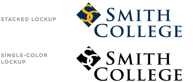
In addition to the standard horizontal lockup, stacked and single-color lockups are available.

Typeface

The Smith College wordmark is set in an adaptation of Adobe Trajan, a typeface based on classic Roman letterforms that were written with a brush, then carved into the stone. These forms provided the basis for the Adobe typeface designed in 1989. The wordmark has been designed with specific dimensions and spacing to be easily read, distinctive and readily identifiable.
The Trajan font is also used in the college’s signage system, which was developed in 1994; the consistent use of typefaces provides an immediate visual connection for campus visitors who have received materials bearing the college's logo.
