Fonts & Colors
Fonts
The branding guidelines update the college design aesthetic with a suite of new typefaces. Note that these guidelines do not affect the fonts used for stationery or business cards.
Primary Display Typeface
Rama Gothic C Bold All Caps is bold, strong and contemporary. This highly condensed typeface works best at large type sizes for maximum legibility and is intended for headlines and occasional use in highlighting numbers or a single statement.

All-Purpose Typeface
Aktifo-A is good for all typographic needs. A clean, modern, geometric sans-serif, it can handle headlines, subheads, call-outs, quotes, numbers, stats and even brief pieces of body copy. A friendly, human typeface, it leans toward slightly casual, so pair with the serif typefaces to balance that feeling. This versatile typeface comes in many weights.

Secondary Display Typeface
Gabriela serves to counterbalance the strong, contemporary feel of Rama. A serif with a lot of personality, it is both fresh and formal, and can help lend an academic feel to our pieces. It comes in a variety of weights, but Smith design leans toward the heavier weights. Use Gabriela for headlines, subheads, large to medium call-outs, quotes and numbers.

Secondary Display Typeface
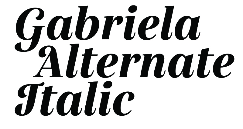
Gabriela Alternate Italic provides alternate characters and accented flourishes that provide energy and personality to a piece. While it is used in the same way as Gabriela, it loses its impact when used often—so be selective with your use.

Text Typeface
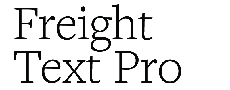
Freight Text Pro is a classic serif with many weights available. This is our workhorse body copy font for print publications, especially when a formal look is called for. Use it for body copy and for small call-outs.

Alternate Typefaces
Sometimes our brand typefaces are not available; however, every computer has fonts that can be used as alternates. Note that because of its unique properties, Rama Gothic C has no good substitute.
Arial is the acceptable substitute for Aktifo A.
Georgia is the acceptable substitute for Gabriela and Frieght Text Pro.
Font Licensing
The typefaces in the college brand represent a range of fonts from respected font foundries. Offices that have a need for design should contact college relations to discuss proper licensing of the college brand fonts. In most cases, offices are responsible for securing their own font licenses. The college-branded fonts all require individual licenses and cannot be shared among peers. Please consider the needs of your office or department carefully.
Colors
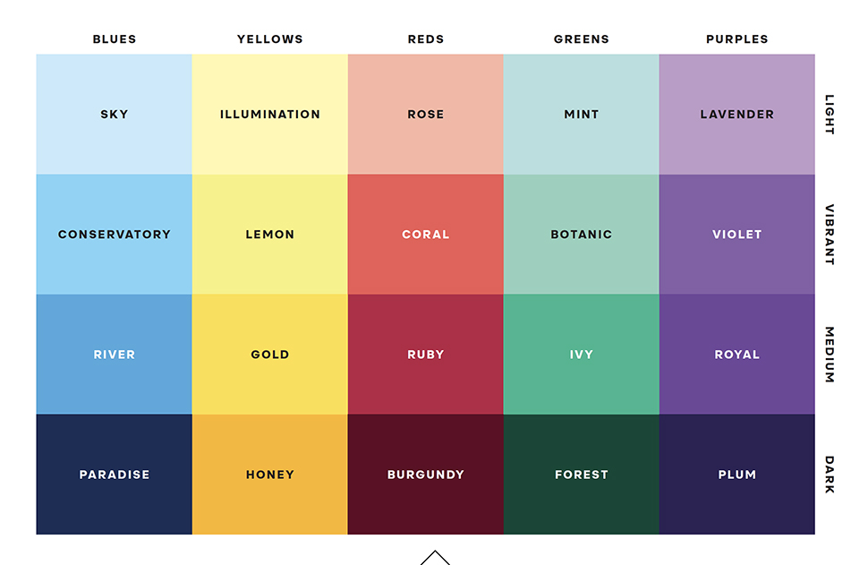
The color palette consists of four variations each of five colors, with the addition of a set of matching neutrals. Each color has a light, vibrant, medium and dark option. This allows for a staggering number of combinations. Avoid going overboard; limit your layouts to two or three colors per spread wherever possible. More than this can cause your design to feel disjointed. Colors do not need to be used in equal amounts.
Always consider the use of white space. Proper white space allows the design to breathe and makes content feel more prominent. As counterintuitive as it may seem, white space has weight. Too much content or too many colors can make for a busy composition.
Black is a strong color that works well with the rest of the palette, but opt for black type on a vibrant background over floods of black. Don't neglect the neutral tones. These act as a balance for the vibrant and dark colors in the same way white does. Use them to fill excess space that would otherwise be filled with white and evoke a different mood.
Refer to the Smith College Brand Guidelines for more information on color combinations; color flexibility; use of color blocks; and for reference of the CMYK, RGB, HEX and even PMS values for the brand colors.
When designing for the website, some colors have minor alterations to accomodate contrast, accessibility and universal design. Please refer to the Color Palette in our Interactive Style Guide for guidance on color usage for Smith College web pages.
Color Overview

