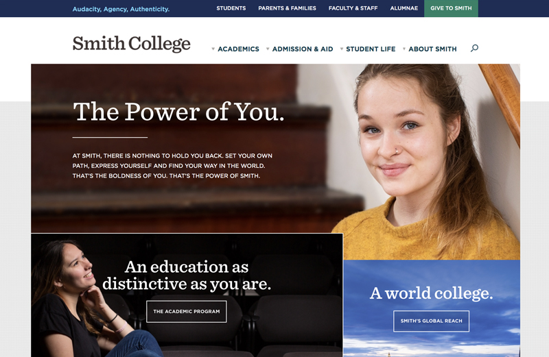
Interactive Style Guide

The Interactive Style Guide (ISG) is the source for standards related to the style, navigation and maintenance of your website. By following these standards, you can ensure that your site remains attractive and well-organized. Use the navigation to find guidelines, samples and ready-to-use bases.
HTML Elements
To help readers scan and retrieve information quickly, and to maintain a cohesive online identity, it is important that all site copy be consistently organized and presented. When writing or editing content for web presentation, observe the following hierarchical organizational structure and make use of the corresponding visual devices.
Page headings are automatically created by the system and use the H2 (Heading 2) styling. The body of your content, therefore, should use H3 as your largest heading, and content should be arranged hierarchically using headings H4 to H6.
H1 Header Style
font: Sentinel,serif;
size: 50px; | weight: SemiBold
H2 Header Style
font: Sentinel,serif;
size: 35px; | weight: SemiBold
H3 Header Style
font: Sentinel,serif;
size: 25px; | weight: Medium
H4 Header Style
font: Sentinel,serif;
size: 18px; | weight: Medium
H5 Header Style
font: Gotham,sans-serif;
size: 14px; | color: #333
H5 Header Style
font: Gotham,sans-serif;
size: 14px; | color: #333
Body Text
Si meliora dies, ut vina, poemata reddit, scire velim, chartis pretium quotus arroget annus. Scriptor abhinc annos centum qui decidit, inter perfec Si meliora dies, ut vina, poemata reddit, scire velim, chartis pretium quotus arroget annus. Scriptor abhinc annos centum qui decidit, inter perfec.
font: Gotham,sans-serif;
size: 14px; | color: #333
Introduction Text
Si meliora dies, ut vina, poemata reddit, scire velim, chartis pretium quotus arroget annus. Scriptor abhinc annos centum qui decidit, inter perfec Si meliora dies, ut vina, poemata reddit, scire velim.
font: Sentinel,serif;
size: 18px; | color: #6E6259
Link Styles
Link Style
Link Hover Style
Arrow Styles
Pointers are used to draw the user's eye to an image or video. These may or may not be animated, depending on the module, but they are not clickable.
Carrots are used to indicate that the user can click to read more. It is placed before a brief Call-to-Action (CTA) such as "Schedule A Visit" or placed after a sentence to specify that there is more to read.
