Modules
The Interactive Style Guide is the source for standards related to the style, navigation and maintenance of your website. By following these standards, you can ensure that your site remains attractive and well organized. Use the navigation to find guidelines and samples.
Home Page Images
Image Specifications
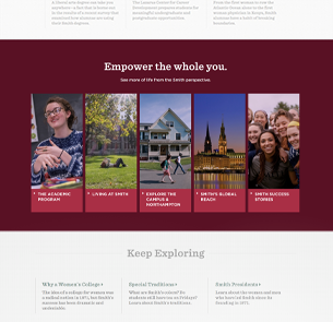
Block one (Empower)
1170 x 465 px
Block two (Academic)
746 x 355 px
Block three (Living at Smith)
746 x 322 px
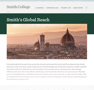
Block four (Global Reach)
423 x 614 px
Block five (History)
1170 x 306 px
Block six (Northampton)
505 x 386 px
Block seven (Success Stories)
664 x 386 px
Featured Content Block
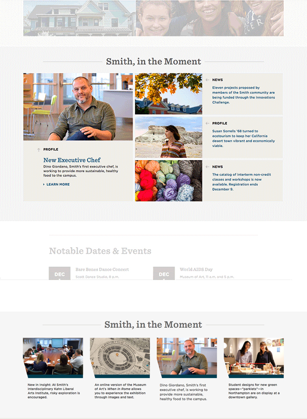
All content for the Featured Content Block module, used on the home page for the Smith in the Moment feature, is created and chosen by the content author, and does not feed in automatically.
Featured Content Block items have a category taxonomy (News, Profile, Exhibition, etc.) The items are interchangeable; they can appear as the featured item on the left, or as one of the three items on the right. The CMS will size the images appropriately.
Alternate View
An separate build mode displays Featured Content Block Items in a horizontal row of four. In this view, the display titles and categories do not appear.
Images
504 x 310 px
Content Type
Featured Content Block
Featured Content Block Inline
Elements
Featured Content Block Item
Build Mode
Featured Content Block (grid)
Featured Content Block Inline (horizontal row)
Events
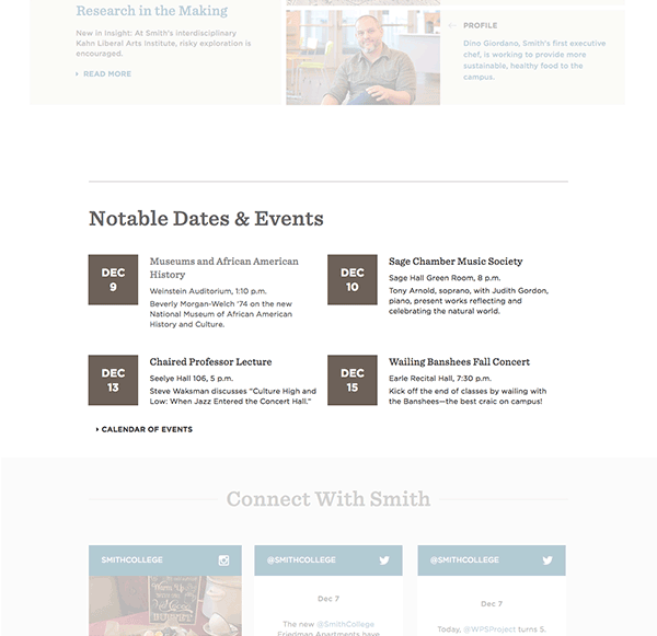
The Events module will diplay the next four Event elements of the proper taxonomy by calendar date; past events are removed automatically at midnight on the day the event took place, and the next event in sequence is added.
Event items show the date, a title, the location and time, and a brief description. Items can link out to more information.
Important events can be tagged by the admin and will display with a "Notable Event" icon. This feature is usually reserved for major all-college events.
Content Type
Event Block
Elements
Event
Build Mode
Event Block
Footer Call-Out
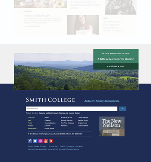
The footer call-outs are organized into "campaigns" (e.g., reasons to visit Smith, reasons to give) so they can be tailored to different areas of the site. The image and "reason," and the corresponding link to other content, load randomly with each page refresh.
The footer call-out is added to a page as a view. Select the appropriate argument number for the campaign you wish to display.
Images
1170 x 353 px
Content Type
Footer Call Out Item
Tier 2 (T2) Banner
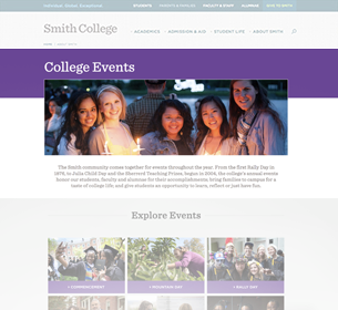
T2 banners are intended for use on major content areas below the site's top landing pages (Courses of Study, College Events, etc.) These pages will typically have an in-page nav module or may be single-page sites.
Image
970 x 303 px (16x5)
Content Type
Banner Content
Build Mode
T2 Banner
Tier 3 (T3) Banner
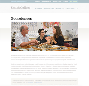
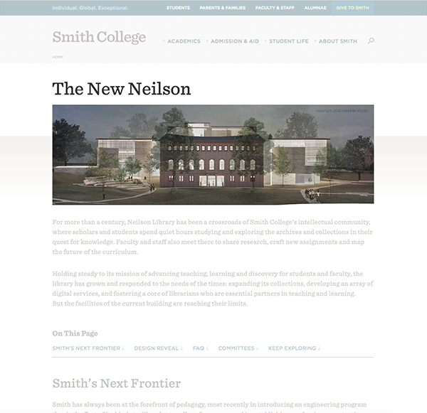
Tier 3 banners are similar to T1 banners but use a grey gradient background instead of a section color. They are intended for landing pages of high-level content areas or single-page sites, such as academic departments.
Image
970 x 424 px (16x7)
Content Type
Banner Content
Build Mode
T3 Banner
Topical Navigation
On topic landing pages, the Topic Navigation module is used so users can keep exploring the other five Smith topics. The topic that you are on should not appear in this module.
Elements
Content Call Out Item
Images
186 x 344 px
Content Type
Content Block
Build Mode
Topical Navigation
Content Call Out
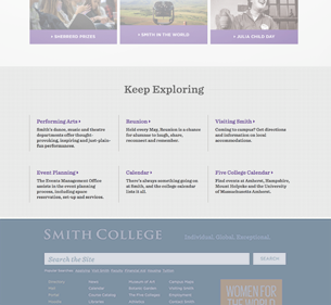
The Content Call Out displays a title, brief description and link for each Content Call Out Item. It is used for in-page navigation, callouts and access to related content. This callout module uses the same format and functionality as the In-Page Navigation module, but does not display the image or link text for the callout item items.
This module is commonly used at the bottom of a page to link to additional or related content, and encourages the visitor to "keep exploring." The highlight color for this module follows the section color.
Content Type
Content Block
Elements
Content Call Out Item
Build Mode
Content Call Out
Promo Content
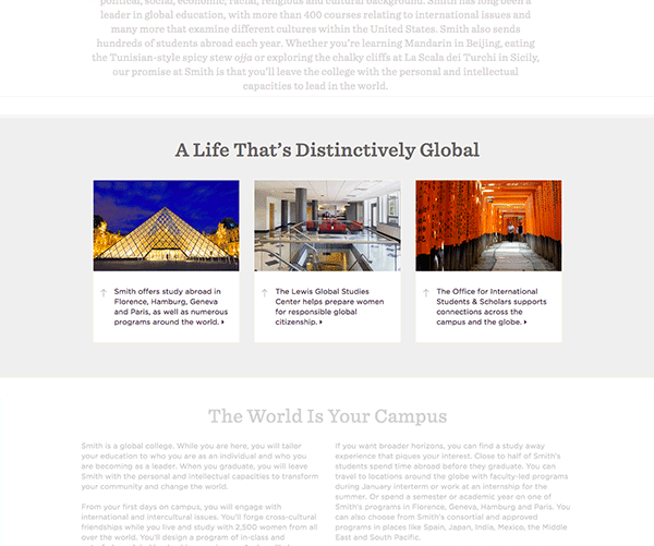
This three-column promo content module includes three promotional areas with description text, header and images. The content appears side-by-side on desktop and tablet and stacks on mobile.
Images
678 x 423 px
Content Type
Three Column Promo
Elements
Content Call Out Item
Build Mode
Three Column Callout
In Page Navigation
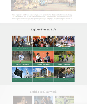
This module uses Content Call Out Items as navigation links to children of the current page, and is used mainly on Tier 1 landing pages. An image and title provide a link. Content Call Out Items fill left to right, in three columns.
The accent color for this module follows the section color. The color cannot be customized.
Images
696 x 391 px
Content Type
Content Block
Elements
Content Call Out Item
Build Mode
In Page Navigation
Tabs & Accordions
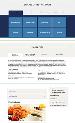
The tabs module is utilized on the Degrees & Programs landing page to display all majors, minors, concentrations, departments and graduate programs. The tabs module can be used on regular content landing pages and enables users to browse through different content topics one tab at a time. Each tab consists of a header and body. The body for each tab can be freeform content including formatted text, images and links. This module will support up to four tabs. Tabs can be used only as tier (wide) content.
An alternate view provides stacked accordions which open and close when clicked. This version has no limit on the number of tab items and can be used as tier (wide) and right-rail content.
Content Type
Tabs
Elements
Tab Item
Build Modes
WYSIWYG Tabs (tab group)
WYSIWYG Accordion (stacked accordions)
Anchor List
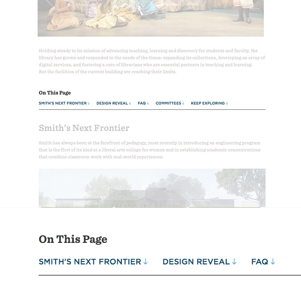
On a single wide page, it may be convenient for users to provide links to the content sections they will find on that page. The anchor list provides direct links to any point on the page you specify. A "Back to Top" link appears when a visitor clicks any of the links, taking them back to the anchor list.
The anchor list links to ID tags (ex: <a id="anchor"> ) you must manually add to your content areas.
Content Type
Anchor List
Build Modes
Full Content
Video
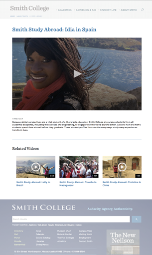
Video content is added to the video library and can then be displayed as tier (wide) content or on right-rail pages.
Video content includes an option to show in the library listing, and includes a taxonomy to show related videos. A 16x9 image should be uploaded for the library thumbnail; the video poster image is drawn from the video itself. Video pages include a caption and a time stamp. The module will integrate with Bits on the Run and YouTube embed codes.
When shown as tier or right-rail content, the caption and time stamp do not display.
Content Type
Video
Build Modes
Video Wide Page
Video in Right Rail Page
Photo Gallery
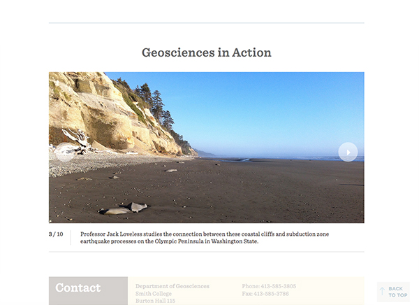
A photo gallery consists of a set of photos, each of which might have a caption. The photo gallery (and its set of photos) may be reused on multiple pages as desired. Individual photos can appear in more than one gallery.
The user may click the arrows to view a particular slide, but the gallery does not rotate automatically. Each slide can have a link to a different page.
There are two build modes for the gallery; one displays the photos at the full 1170-pixel width, and the other shows the same content at a maximum width of 970 pixels.
Image Specifications
1170 x 561 px
Content Type
Photo Gallery
Build Modes
Photo Gallery Wide (1170 px)
Photo Gallery 970 (970 px)
Photo Gallery Narrow
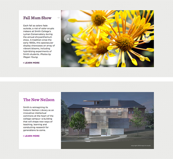
This photo gallery variant includes text and one or more associated images. It can be used as a smaller version of the photo galleries if there is no need for individual captions; the content on the left remains the same for all images if there is more than one. Slide-show controls are visible only if there are multiple images.
Image Specifications
647 x 398 px
Content Type
Photo Gallery
Build Mode
Photo Gallery Narrow

